Tanner Christensen's 45 Commandments to Design an Unforgettable Logo
In the world of graphic design, the logo is crowned as the undisputed king of brand identity. Tanner Chrisensen, an authority on the subject, proposes a series of sacred rules that every designer should follow when creating or redesigning a logo. Below, we explore these essential regulations that promise to turn any design into a timeless and effective masterpiece.

Limit the design to no more than three colors.
Keep the color scheme simple to ensure recognition and ease of printing in different media.
Remove everything that is not absolutely necessary for the design.
"Less is more" is particularly relevant here. Strip away any element that doesn’t contribute clear meaning or aesthetic value.
Typography should be simple enough for your grandmother to read.
Ensuring the text is accessible to a broader audience, including the elderly, enhances readability and broad appeal.
The logo must be recognizable in any situation.
A great logo should be immediately identifiable, maintaining its effectiveness across various applications.
Create a unique shape or layout for the logo.
Originality helps your design stand out in a sea of brands. Being unique fosters memorability.
Completely ignore what your parents and/or partner think of the design.
Sometimes, family opinions can be subjective. Maintaining an objective, professional perspective is crucial.
Ensure the logo looks attractive to more than three (3) people.
Diverse opinions can enrich the final outcome. Make sure the logo appeals to a range of individuals.
Do not combine elements from popular logos and then claim it is original work.
Inspiration is valid, but direct copying of popular elements is not.
Do not use clipart under any circumstances, create your own image.
Crafting original images is essential. Avoid clipart to create something genuinely unique.
The logo must look good in black and white.
Ensuring the design works well in black and white is crucial for uses in media that restrict color.
Ensure that the logo is recognizable when inverted.
The logo should maintain its integrity and identity even when reversed.
Ensure that the logo is recognizable when resized.
The logo should be legible and aesthetically pleasing at any size.
If the logo contains an icon or symbol, in addition to text, place each in such a way that they complement each other, and are necessary.
Both elements should be arranged to enhance each other and be necessary to convey the complete message.
Avoid recent trends in logo design. Instead, make your logo look timeless.
Steer clear of fleeting design fads and opt for a design that withstands the test of time.
Do not use special effects (including, but not limited to: gradients, shadows, reflections, and beams of light).
Simplify your design by avoiding these effects that can complicate the logo.
Fit the logo to a square layout as much as possible, avoid complicated layouts.
A square or simple layout facilitates application across different contexts and media.
Avoid intricate details.
Detailed elements can get lost or create confusion when the logo is scaled down.
Consider the different places and ways in which the logo will be presented: brochures, websites, merchandising, press, paper, plastic, etc.
A versatile design performs well across all these mediums.
Invoke bold and confident feelings, never boring and weak.
The design should evoke a positive and strong reaction, never being dull or underwhelming.
Realize that you will not create the perfect logo.
Acknowledging that perfection is an ideal, not a reality, focuses on effectiveness and representation.
Use hard lines for tough businesses, and soft lines for gentle businesses.
The style of the lines should align with the nature of the business.
The logo must have some connection to what it is representing. It should evoke it.
The design should in some way reflect what the company represents or sells.
A photo does not make a logo. A logo is a logo and a photo is a photo.
A logo should be a simplified graphical representation, not a photograph.
You must surprise consumers with the presentation.
Innovate in how you present the logo to the world, making its debut memorable.
Do not use more than two fonts or typographies.
Limiting the number of fonts ensures consistency and readability.
Every element of the logo needs to be aligned. Left, center, right, top, or bottom.
Proper alignment ensures a clean, organized design.
The logo must look solid, without any hanging elements.
The design should be compact and coherent, without any out-of-place or unbalanced elements.
Find out who will see the logo before thinking about ideas for it.
Understanding the audience guides the aesthetic and functional direction of the design.
Always choose function over innovation.
While innovation is important, the functionality of the logo should not be compromised.
If the brand name is memorable, the brand name should be the logo.
Consider using the brand name itself as the main element of the logo if it is distinctive and memorable.
The logo must be recognizable when a mirror effect is applied.
Like inversion, ensure the logo maintains its identity even when mirrored.
Even large companies need small logos.
Large brands also need logo versions that can adapt to small spaces, like icons or avatars.
The logo design must be liked by everyone, not just the business using it.
The design should appeal to a broad audience, not just internal stakeholders. It’s for the customer, not the company.
Create variations. The more variations, the more likely you are to get it right.
Producing multiple variations can help refine the final design, providing options to choose the most effective one.
The logo must look consistent across multiple platforms.
It should maintain its integrity and style across different platforms and media, from digital to print.
The logo must be easy to describe by one person explaining it to another.
The design should be simple enough that someone can easily describe it to another person.
Do not use taglines in the logo.
Keep the logo free of slogans to maintain simplicity and focus on the brand itself.
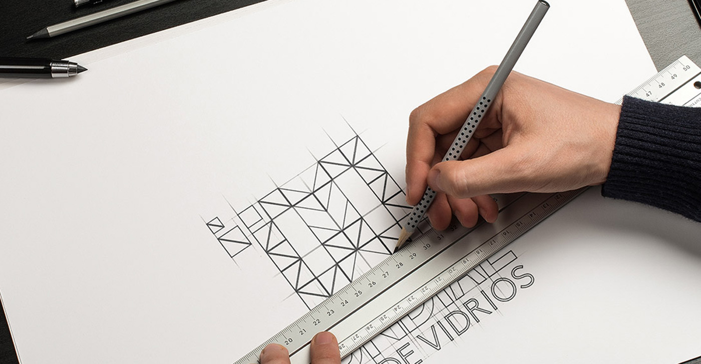
Sketch ideas using pencil and paper before working on the computer.
Starting with sketches can help quickly explore ideas effectively before digitalizing the design.
Keep the design simple. The simpler, the more perfect.
A simple design is not only more aesthetic but also more likely to become an iconic and memorable symbol.
Do not use “swoosh” symbols or globes.
Such common symbols rarely offer a unique distinction; it’s better to avoid them.
The logo should not distract, it should inform.
The logo must clearly communicate who the brand is without causing distractions with an overly elaborate design.
It must be honest in its representation.
The design should be a straightforward and honest reflection of the brand, without deceptive pretenses.
The logo must be visually balanced.
Balancing the visual weight and appeal across the design creates harmony.
Avoid bright neon colors and dull, dark colors.
Opt for a color palette that works well in a variety of settings and avoids harsh or indistinguishable colors.
The logo must not break any of the rules mentioned above.
A good design adheres to all these guidelines to ensure the logo is not only aesthetic but also functional and suitable for its purpose.
Continuing with these rules, Chrisensen invites us to reflect on the importance of coherence, simplicity and originality in logo design. By adhering to these guidelines, you not only create a visually appealing brand, but also a functional and iconic one. The next time you're faced with the challenge of designing a logo, consider these 45 commandments; They could be the key to unlocking the full potential of your creativity and technical skill.
This set of principles offers a robust framework for logo design, encouraging creativity within parameters that have proven effective over time. By following these commandments, designers can aim to create logos that not only visually represent a brand, but also forge a lasting connection with their audience.


